
This design builds on the previous design’s attempt at conveying Platonic Idealism. In order to depict the ideal of an object, perspective should not be consistent, thus highlighting a philosophical fallacy in the previous design. To depict an ideal is not to create pieces of the same instances and angles. It makes sense that there should be no signs of a particular instant in an attempted depiction of an ideal.
Perceptual constancy refers to the human brain’s ability to perceive objects as what they are despite the difference of angle or perspective. Our brains can identify a particular form of an object despite irregularities. We can determine what an object is from many different angles, perspectives, shades and tones. Therefore, we can identify objects as representations of their ideal regardless of irregularity. This is important as ‘ideals’ stem from our visual systems’ mature understanding of the objective world. As such, there must be a harmonious/homologous relationship between depictions of philosophical concepts in design and the function of the human visual brain. It is therefore not possible to display an ideal with a pure focus on constancies.
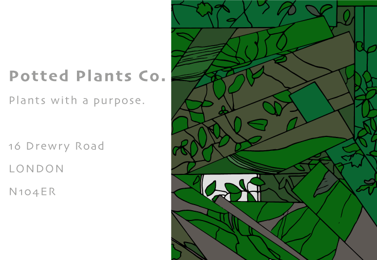
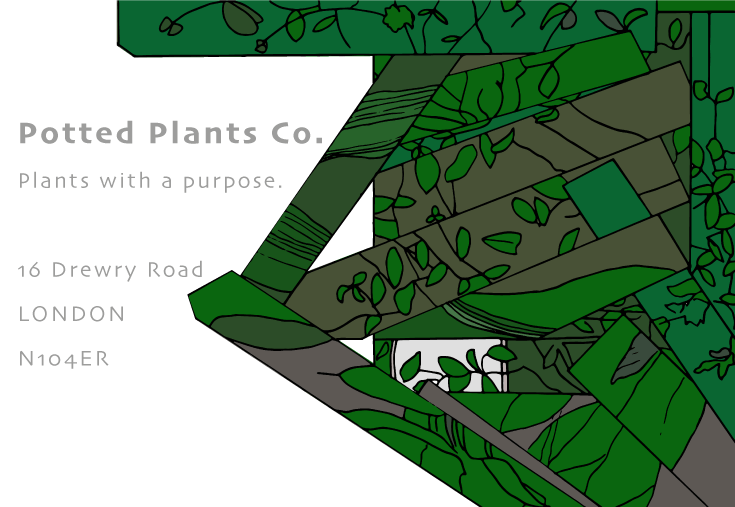
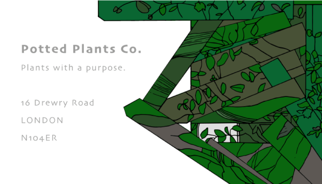
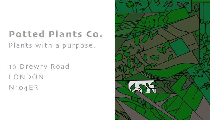
This piece attempts to attack this by depicting potted plants from different angles, focuses and distances while also representing constancies.
How it was made: (see below).
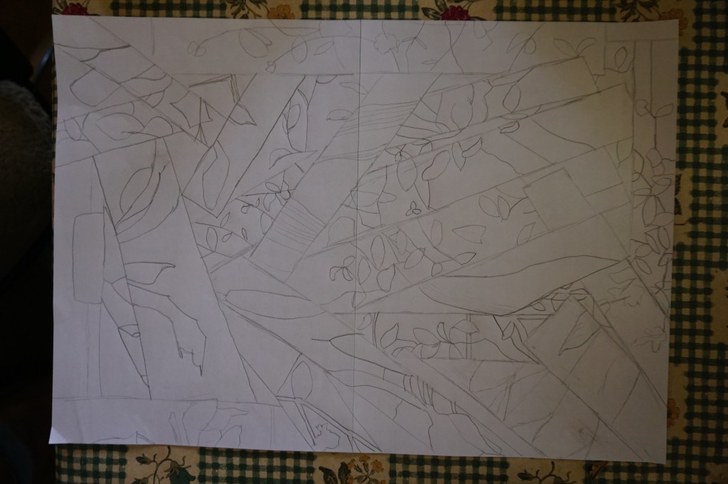
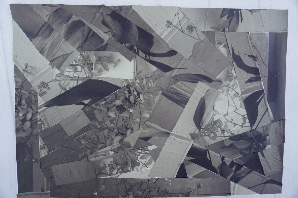
The idea for obtaining perceptual constancy was to take photographs of a number of potted plants, demonstrating constancies as well as different perspective and angles. These photos were printed and then cut into vertical or horizontal strips before being stuck on to a canvas. Once the collage was completed, it was sketched on a separate canvas. This sketch was scanned and uploaded to Adobe Illustrator were it was vectored and coloured to match the tones of the photographed plants.
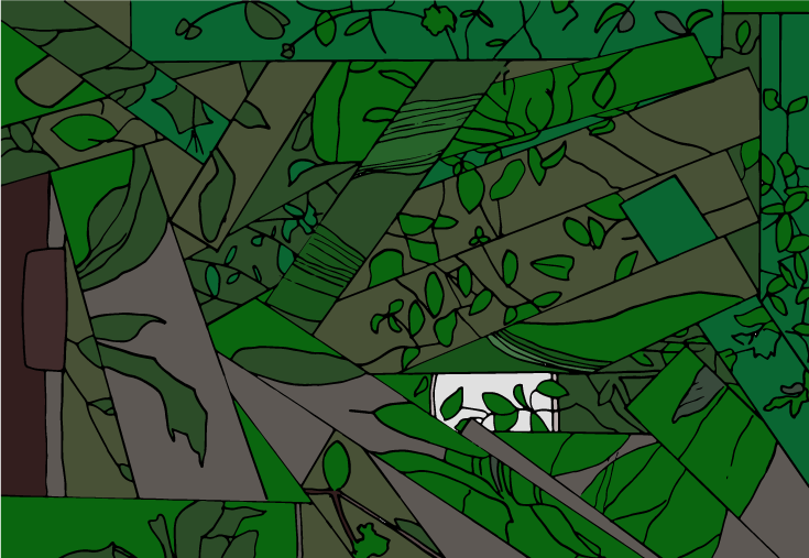
The aim of this project was to obtain and portray a level of perceptual constancy, as the brain is able to in everyday life. While the design covers angles and constancies of potted plants, it is not really achieving the feat of perceptual constancy. The only way that one could observe that this design does in fact depict a potted plant is by having the knowledge beforehand. It does work in the design of the business card as the name of the company is a precursor to what is depicted in the design however, as a stand alone design, it does not seem to achieve what was intended. In fact, it has similarities with cubism (https://en.wikipedia.org/wiki/Cubism).
